


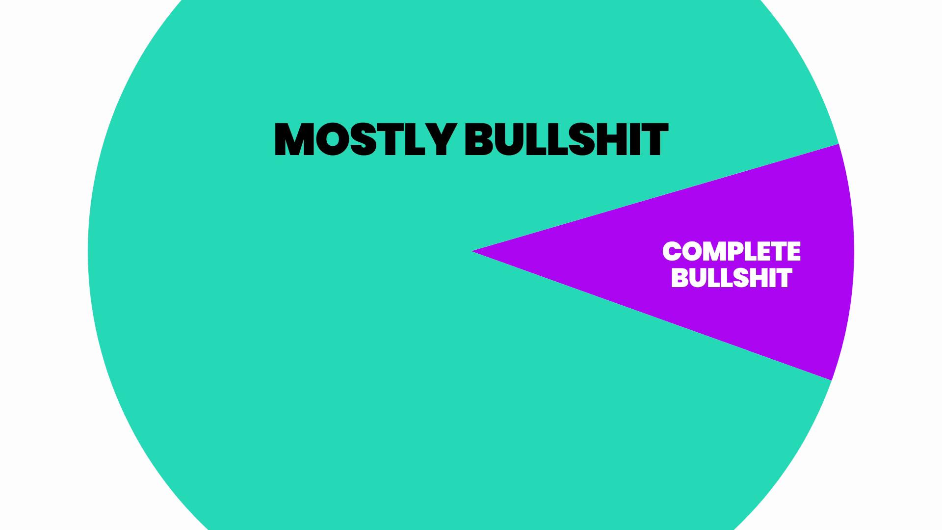
An Ode To Bullshit Graphs
Econo-speak has long been used to mask political agendas.

Economic graphs are like the intellectual equivalent of hired muscle.
‘You can see what I mean in this graph’ is a -
‘Close the door Angus.
[clunk]
Now, I’ll ask you again…’
- sort of trick that is meant to intimidate you into thinking those numbers and lines will beat you to a bloody pulp if you don’t agree with the premise.
Is it because ‘economics’ is seen as a rational brand of thinking?
If so, I’ve got some bad news for you about economics and the graphs it produces.
Take Marc Andreessen’s ‘Selected US Consumer Goods & Services, Wages’ graph from a 2023 article:

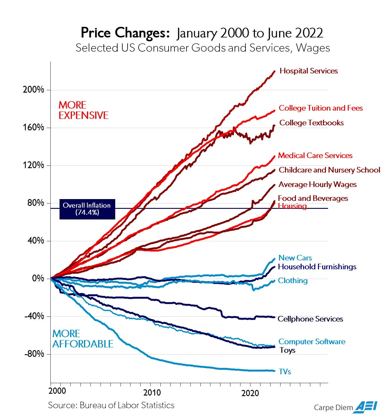
The blue lines? Sectors where technological innovation has slashed costs. The red lines? Sectors like education, healthcare, and housing, where prices have skyrocketed. The takeaway? Government interference is the problem.
Looks like a slam dunk.
Tisn’t
For starters - correlation is not causation. Wright’s Law makes mass-produced goods cheaper over time. True. This is largely explained by automation and less reliance on labour per unit of output.
But land, healthcare, and education aren’t widgets rolling off an assembly line. Labour - especially in fields like childcare and medicine - doesn’t get exponentially cheaper just because we might wish it did. Inflation always sounds bad til it’s your wages that are going up over time. And if there are sectors with more humans in them (the most expensive line in any business P&L) then - how amazing! - their costs are going to rise over time.
In short - take pesky, smelly human beings out of any part of the economy to the degree that automation allows and watch the costs of that part of the economy fall.
Meanwhile, some of those red-line industries could be far cheaper (education, cough), but status gatekeeping keeps them expensive. Want knowledge? It’s almost free online if you’ve got the time (I mean online classes not “I did my own research”).
Want the credentials that gets you in the club? That’s Ivy League or Oxbridge, baby.
Pay up.
But hey, at least you can get a cheap TV.
The Many Forms of Bullshit Graphs
Andreessen’s graph is far from the only one used as economic cos-play. Bullshit graphs have been repeating, like indigeston, for decades, even before the internet, always finding new ways to mislead the public while giving off the illusion of objectivity. Here are a few other classics:
Inflation Panic Graphs
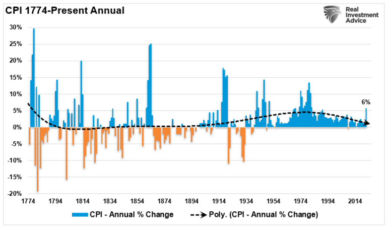
Graphs that scream ‘inflation is out of control’ while omitting the MASSIVE swings from the Gilded Age - when inflation and deflation wreaked havoc. The real story? The past few decades have seen some of the most stable inflation rates in history, but if you frame the graph right, you can always make it look like we’re spiraling into hyperinflation.
This one starts conveniently at 1910 and shows - HORRORS - your $100 was able to buy half of Oklahoma in 1910 so why can’t you stick that Benjamin under your mattress and still buy half of Oklahoma in 2025?
Umm... because you’d be dead?
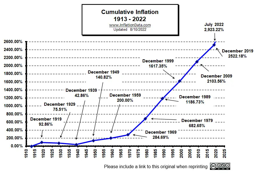
Joking aside - what this graph hides is that even at low levels inflation is most dangerous to the super wealthy. It’s the opposite of compound interest. If you can’t sit on multi-generational wealth as cash because it will get eroded over time, then you’re going to have to do something productive with it.
Now do incomes
For the regular working person living month to month the inflation graph you should be most interested in, is the one that shows incomes as well as inflation. As long as you’re earning and investing any surplus in something productive like your own business or your education or shares, accumulative inflation is meaningless.
Those poor wealthy though. After 200 years, that great, great, great grandson; little Johnny the VIII will run out of dosh and need to go work as an economist.
But the even bigger picture is: look at the longer term when money was a commodity and backed by gold. The enormous swings in both inflation and deflation were incredibly destructive. It’s only because of the Great Depression the lesson was finally learned. Hard money had served a purpose before the Industrial Revolution, maybe, but no longer.
The Productivity vs. Wages Chart
Ah - the classic ‘productivity has skyrocketed while wages have stagnated’ graph. This one’s tricky because it’s true, but it’s also used to argue wildly different things.
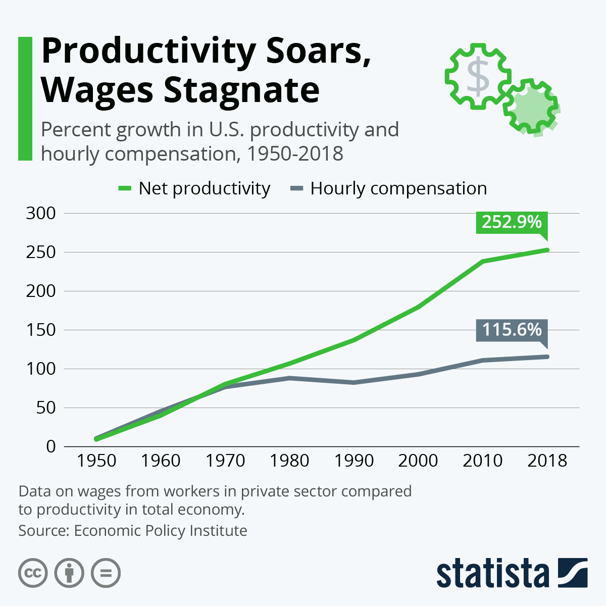
Tech libertarians and gold bugs will say wages stagnated because of the end of the gold standard in 1971 (the zombie idea - as above - which refuses to die) and it was Nixon that unleashed inflation and eroded real wages.
The traditional left will point to declining worker power, the rise of stock buybacks, and corporate profit-hoarding.
What’s missing from most versions? The huge productivity gains from automation of many workplace tasks that went straight into CEO pay and shareholder dividends.
GDP Growth as a Measure of Economic Success
A perennial favorite. GDP is up, therefore everything is great!
Never mind that GDP includes all sorts of economic activity, including things that make life worse. Car accidents? Great for GDP. Expensive healthcare? Fantastic! Student debt? Even better. But providing healthy school meals or a government program that grants people free childcare so they can participate in the economy? Woah, woah, we can’t afford that - think of the deficit!
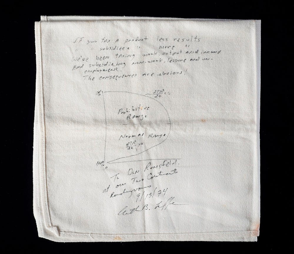
The Laffer Curve
A graph so bad it refuses to die. Legend has it Arthur Laffer sketched it on a napkin for Dick Cheney in 1974, selling the idea that cutting taxes magically boosts government revenue. The idea? Tax too much, and people stop working; tax too little, and the government collects nothing. Somewhere in between is the sweet spot.
Neat in theory - garbage in reality.
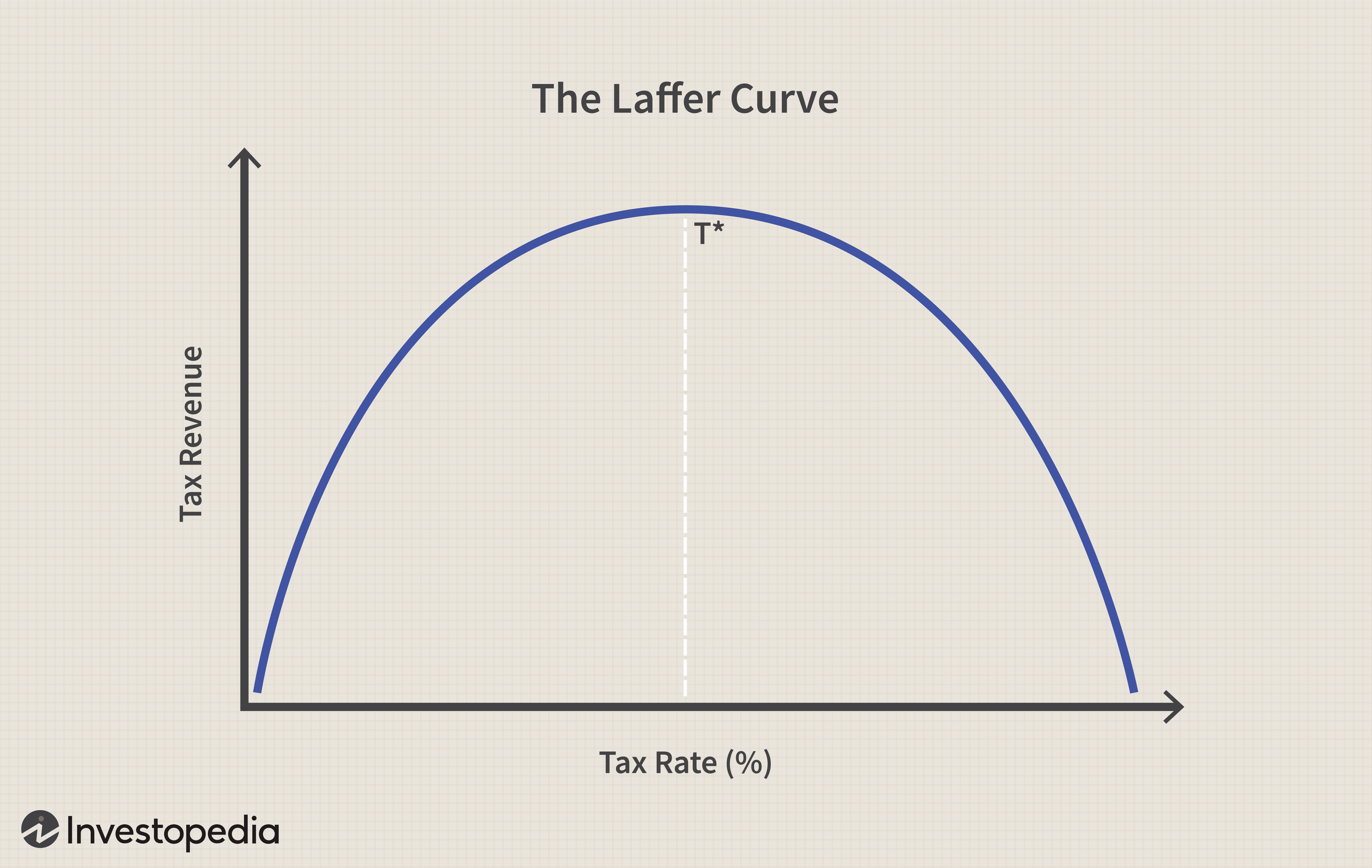
The problem? It assumes a flat tax base, ignoring that real economies have layered, progressive tax systems. Without massive reform, finding this 'ideal' tax rate is just a guessing game and usually a gift to the rich. History tells us tax cuts for the wealthy don’t ‘pay for themselves.’ They just let more (democracy skewing) wealth pile up at the top.
And that magic revenue-maximizing rate? Never on the graph. Because if you don’t put a number on it, you can always argue we just need ‘more cuts’.
Sounds clever. But like most simplistic economic models, it collapses under scrutiny.
Full transparency - I’m in favour of a flat tax in the form of an Automated Transaction Tax plus tax reform and an end to income tax. But without some form of UBI it would be incredibly regressive.
For more on that:

Graphs as a Weapon of Ideology
The real problem isn’t just that these graphs are misleading—it’s that they are used as weapons to shape policy. Andreessen’s graph is designed to push deregulation and privatisation as the solution to everything. The Laffer curve makes it look like higher taxes on the super wealthy serves no purpose (let’s say above 20 million in case anyone reading this thinks they’re the target of this comment because most who have anything towards a million think they’re the target of ‘envy’ when they are actually small fry).
At their core, bullshit graphs exist to manufacture consent. They make an argument look like an inevitability. They frame a political position as a technical truth. And because they have numbers, trend lines, and a whiff of authority, people assume they must be legitimate.
How to Spot a Bullshit Graph
Cherry-picking: Are the data points carefully selected to make a point rather than reflect reality?
Y-axis manipulation: Is the scale adjusted to exaggerate or minimize differences?
Omitted context: What’s missing that would change the story?
Causation vs. correlation: Is a trend being used to imply causation without actual proof?
Political framing: Who benefits from the conclusion this graph is pushing?
The Solution? Less Graphs, More Thinking
Here’s an radical idea: let’s demote economics til no one wants to use any bullshit graphs at all. Modelling by using system dynamics as practiced by Ty Keynes and Steve Keen is now so advanced that you can test drive new ideas, policies and tax on a national model before your pet theory blows up millions of livelihoods.
They both use Steve’s software as they do live on Steve’s livestream (it’s not sponsored - I’m the host of the show and I just think what they’re able to do is brilliant):

Economics isn’t physics. It isn’t some natural law of the universe. It’s a messy, human-made system full of politics, power struggles, and deeply entrenched interests. And the sooner we accept that, the sooner we can stop being duped by bullshit graphs and start actually solving problems.
So next time you see a neat little graph trying to sell you a worldview, don’t just nod along. Squint at it. Pull at the edges. See if it unravels.
Chances are - it will.
A good graph is great. And can also mislead if you can’t interpret it. Your five suggestions are a neat summary of how to avoid being duped. Nice.